

Off Color Brewing Introduces Beer Emblems to Continue the Brewing Conversation with Consumers
Some breweries just do things differently. Whether it’s through a specialized brewing process, unique can art or a niche marketing approach, it’s a smart business strategy to stand out from one’s competitors. Off Color Brewing is one of those unique operations.
The Chicago brewery is known for its love of cats and numerous experiments with funky fermentation processes. Its brewing is regarded as an art form that cannot be painted in broad strokes or stylistic classifications. Instead, each specific aspect of the wild brewing endeavors conducted by brewers and co-founders John Laffler and Dave Bleitner demand denotation so that it can be celebrated and understood by the typical consumer. So, Off Color is bringing something new to the marketplace that has already been met by a bevy of consumer excitement. It’s not a new beer or yeast strain, it’s beer emblems.
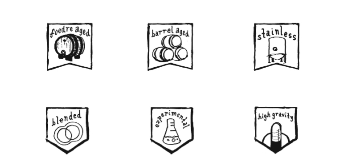
Off Color formally announced the news to much fanfare from consumers on Friday. In total, the brewery is rolling out 15 emblems, like Funky, Wild Fermentation, Botanical, and Barrel Aged, that will appear across their packaging, from the cardboard carrier to the bottle. Each emblem embodies a particular brewing process or characteristic of the beer that informs the consumer of what they’re drinking. For example, the brewery’s recent Class War Ale receives the Smoked, High Gravity, and Traditional emblems on its 4-pack packaging to convey its smokey flavor and rich, dark malt base. Only the most prominent emblem makes it on the actual bottle.
Labeled a Gotlandsdricka-Style Ale, many consumers—myself included—might not know what to expect from Class War initially. The new emblems help with that. “We’re always working toward making beers that are more and more complex,” said John Laffler, Off Color’s co-founder. “These emblems serve as a quick cheat sheet to highlight some of the characteristics and production methodologies that we think are important to help folks have a better understanding of what the beer is going to taste like and, more importantly, why.”
To best convey the processes involved and flavors in our beers, we’re adding emblems to many offerings that will inform beer drinkers on a range of factors such as fermentation type, fermentation vessel, etc., as well as serve as signifiers for what flavor profiles to expect. pic.twitter.com/cWDVcpMZXY
— Off Color Brewing (@OffcolorBrewing) February 22, 2019
Knowing what is exactly in one’s food has become table stakes for consumers. Recent campaigns from Big Beer have also highlighted the core ingredients of what’s in its beer (even if they do so misleadingly). And while Off Color does do an annual collaboration with Miller High Life, one of the goals for these new emblems is not around what makes a light lager but what can be classified as a “sour” beer. Laffler explained:
“That sour/wild confusion was a portion of the reasoning behind adopting the emblems. We’re hoping they are able to give folks a better idea of whether or not acidity is a primary characteristic of the beer and how that acidity was created.”
“The more people are able to uncouple the idea that wild yeast necessarily creates sour beer, the better.”
But how do you create an emblem that illustrates acidity? One might think it should be bright and full of color, but that doesn’t vibe well with Off Color’s core branding. Instead, each emblem is in black and white and features one hero image that illustrates the key message. For the Experimental emblem, it’s a lab beaker. The acid emblem gets a dripping lemon.
It’s a delicate process to stay on-brand while also providing enough heuristic meaning for the consumer to understand in a snap judgment what Off Color is trying to convey. Tim Breen, Off Color’s graphic designer, notes that once they decided upon what language they wanted to feature, the art followed. “The facts are discussed in the language; the images are how we express our personality…We are talking about ideas here, not trying to be dogmatic or lecture people. So it’s fun to keep the art loose.”
The new @OffcolorBrewing beer badges on Class War and Jerk Bird 👀👀 pic.twitter.com/zIwqKP78Aj
— Taylor Laabs 🍺 (@TaylorLaabs) February 23, 2019
With the creativity found within the walls of the Off Color Mousetrap, it would make sense that coming up with a clear and concise first set of emblems would take some time. Tim says that narrowing down the list was the hardest part. Once they had the framework in place, however, Tim said that it took him about five minutes to create a new emblem.
The cat emblem, which came as a special request from Laffler given the brewery’s affinity for felines, proved to take the longest to create—about 10 minutes. Much like an uncovered piece of ancient art, the brewery found inspiration for its cat emblem in a random cat image the crew discovered on a brewhouse wall.
Each of the 15 emblems produced by Off Color should be appearing on its designated packaging formats now. Ben Ustick, Off Color’s media relations guru, says that more emblems will be on their way down the road to meet the unique characteristics of future Off Color creations.
I’d be surprised if these emblems don’t make their way onto branded merchandise as well. I’d pay good money for a John Laffler cat emblem sticker, and I feel like I’m not alone.
Feature image courtesy of Off Color Brewing.

Related Posts
Ultimate 6er | Packing Up & Moving Out April 12, 2018 | Mike Zoller

With More Space, Off Color Brewing Expands on its Uniqueness... March 22, 2018 | Taylor Laabs
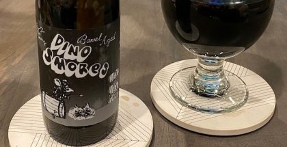
Strong BA Series | Off Color Brewing Barrel-Aged Dino S’mores... December 7, 2020 | Mike Zoller
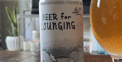
Off Color Brewing | Beer for Lounging Pale Ale... February 18, 2022 | Ben Garbarek
Submit a Comment