


5 Questions with Schlafly Brewing’s Lead Designer, Sarah Frost
 Story by:
Taylor Laabs
Story by:
Taylor Laabs
Picture your favorite beer. What do you see? Maybe it’s poured in a proper glass, bubbles bursting. Odds are though, you’re picturing the can or bottle the beer initially came in. While the liquid itself brings great pleasure, it’s typically the vehicle it comes in that you associate with first. That’s why beer can artwork is so fun, so creative, so celebrated at times. Because it makes the beer standout both on-shelves and in your mind. St. Louis-based Schlafly Brewing continues to churn out great beer can designs that celebrate the history or place of origin behind a beer’s name or style. It’s a unique approach that has paid dividends for the brewery and for their lead designer, Sarah Frost. To learn more about Frost’s unique approach to beer can art, what inspires her and what labels she’s most excited about this year, I asked her five questions.
What types of things inspire you when creating new beer artwork?
“Research is a big inspiration—information about a beer style, its characteristics, history, place of origin, etc. This initial info drives choices about imagery, style, type and color palette, which may evolve through additional research and, in turn, generate more ideas. I frequently find bits of type on a building, a quality of light, color or other visual things in daily life to be inspiring; I keep a sketch book—with drawings, sketches, ideas, notes on color, etc.—and take a lot of pictures with my phone. Often elements from these sources of inspiration and the research will converge in an organic manner over the course of a project. Finally, the work of others inspires me —artists, designers, type designers and many others.”
Explain the creative process behind your artwork—how much do you collaborate with the brewing team?
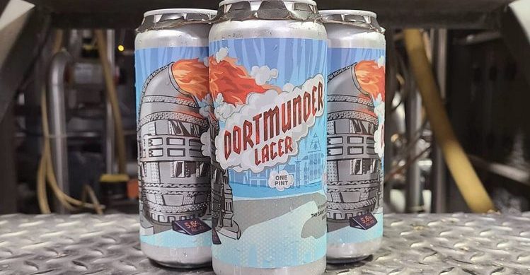
“Collaboration is key; I like to start the process by talking with the lead brewer on a project—usually Jared Williamson—and getting his take on our production of a given beer, which is a great jumping-off point for research and design. I often find this input more interesting and useful than general beer style information I find on my own. For example, he said Dortmunder originally served as the working man’s beer of choice post shifts in either the steel mills or the coal mines in the industrial city of Dortmund.
I read about those industries and discovered that a Bessmer converter, a relic from the steel industry, sits on the riverfront there. It’s an interesting looking object, and for me the form evokes some kind of industrial droid-like thing from Star Wars. I worked on sketches and ultimately drew that belching out flames, smoke and type as the main element, combined with an abstracted cityscape.”
What is the favorite Schlafly beer label you have made?
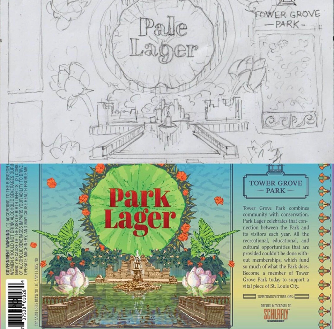
“There’s no single favorite, but I recently enjoyed working on the Dortmunder and Baltic Porter labels. These two are part of our brewpub only series, brewed in one small batch and only available while they last in our brewpubs. I enjoy the creative freedom attached to this series, as it is agile and includes a wide variety of styles. I also particularly enjoyed working on Park Lager—a beer we brewed in collaboration with Tower Grove Park. It consists of a set of four labels, each depicting a different landmark and kinds of flora in the park; I enjoyed the research, design and illustration of these. I guess a more succinct answer would be that there’s no single favorite, but the variety is my favorite!”
What are the unique challenges and opportunities of creating art on a 12oz can?
“One challenge of wrapping flat art onto a curved can is that sometimes distortion is necessary to make things work. For example, the circular Schlafly logo must be distorted to look round on a can. In addition, if the cans are packaged in rings or a collar rather than encased in a wrap, the cans may face any direction. The designer must plan for that to ensure that the necessary elements will be seen. One opportunity is the larger area for graphics, especially in comparison with our bottle labels. Instead of two small labels, neck and body, the canvas is taller and wraps all the way around the can. Since every label has mandatory elements like the government warning, this space is a real advantage and allows more room to tell a story. This area also may be divided into two or three different sections that correspond to how much can be seen at once time, given the way the can is turned. This yields lots of possibilities.”
What label or project are you most excited about this year?
“In terms of new design, I am excited to continue the brewpub-only series, as well as potentially extending Park Lager. I’m also looking forward to re-designing our Pumpkin Ale packaging as well as working on some other projects that it’s too early to talk about yet. In addition, I’m looking forward to seeing how several already-completed projects perform in market this year, such as the new Coffee Stout can 12 pack.”
[mc4wp_form]

Love the article on Sarah Frost from Schlafly. Know that the city is Dortmund, though, not Dortmunder.