An Ode To Label Art | Fair State Brewing Cooperative
It’s no secret on this site that I’m a fan of Fair State Brewing Cooperative. Whether classic styles like their Pils or Hefeweizen, their famous Roselle kettle sour or their beautiful hazy creations like Spirit Foul and Mirror Universe, the Minneapolis cooperative cranks out some of the best in the area.
But as much as I appreciate the beer coming out of Fair State, I always admire what’s outside the can. To celebrate Beer Can Appreciation Day, let’s take a deeper dive into Fair State’s label art.
Since their beginning, Fair State matches beer quality with branding and visual identity. As someone in the advertising industry, I often anxiously await their new designs as much as the beer itself. And yes, I’m the guy who stands in front of beer coolers staring way too long at the art on local can and bottle canvases.
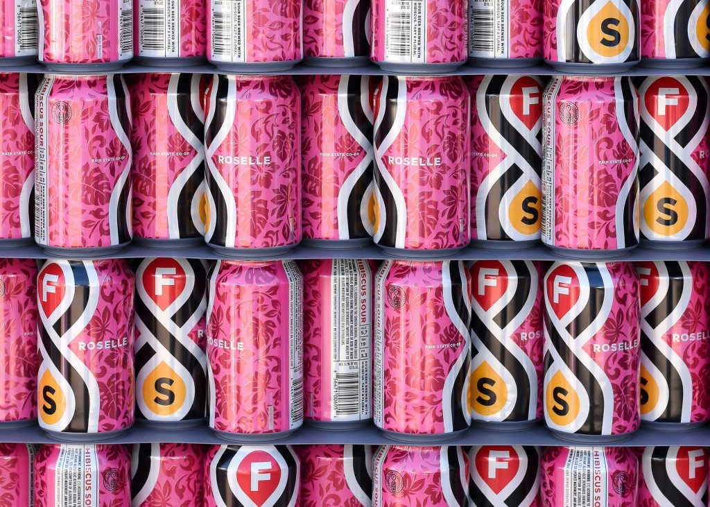
And I’m not the only one who shares this admiration. Fair State’s Roselle and Spirit Foul have historically been named one of the 30 Best-Looking Beer Cans in America by Ceros Originals. Roselle in 2018 and Spirit Foul in 2019.
This branding success ultimately ties back to the care and respect that Fair State puts into every beer.
“We care a lot about everything that goes into our beer,” says Evan Sallee, Founder and CEO, Fair State Brewing Cooperative. “The can is the first thing you see, so it’s important to view the entire package as a whole and treat every aspect of the beer with that respect.”
Challenges and Limitations
With its size and the circular design, 12 and 16 oz. cans present a unique medium from a design perspective. Additionally, there are many legal requirements about content that must go on the can. Sometimes the canvas can prove quite tricky, but Sallee and his team always go back to thinking about how people are going to view and interact with the can.
“You have the circular item with a lot of real estate on it, but at the same time, when it’s on the shelf, you only see half of it, and it may not be recognizable,” says Sallee. “It’s imperative to think about it that way.”
To Infinity
To navigate this challenge, Sallee and his team lean heavily on the striking Infinity Pint design featured on most of their core beers—aside from Mirror Universe. A product from the minds of Fair State’s Minneapolis design firm Little, the Infinity Pint ties into Fair State’s history as the third brewery cooperative in the country.
From Little:
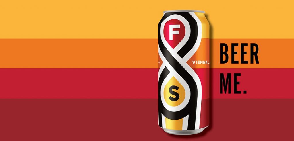
We celebrated Fair State’s community focus with the iconic “Infinity Pint” – and infinity symbol that morphs into a beer glass – representing the unending connection between brewer and community.
As a prominent feature in their designs, the Infinity Pint creates the effect where most people can look across the liquor store and see where the Fair State is.
Once customers discover the Fair State section of their liquor store, then they’ll happen upon some of the brand’s more limited items – like Spirit Foul or Dry January. With these designs, Fair State stretches its wings more creatively to make something that causes people to pause and take a long look.
Design by Process
Fair State’s design success ties to its attention early in the beer-making process. Shortly after solidifying an idea for what a new beer is going to be, the brand team generates a product brief. Briefs are a cornerstone of creative industries. They’re the first step of a 1,000-mile brand journey. A project’s success is often tied back to a solid creative brief. It’s a step Fair State uses to outline what their picture of what the beer is. Why is it important to them? Why is it important to their members and customers?
Once Fair State’s brand team fully generates their project brief, they provide it to Little. Little’s philosophy is “design is everything.” The small but mighty firm builds brands from inside out, partnering with organizations like Buffalo Wild Wings, Target, GAP, the Minnesota Timberwolves and more, in addition to Fair State.
“Little has been with us since the absolute beginning,” says Sallee. “They’re an amazingly talented, creative group of people, and we’ve built a great history.”
In addition to Little, Fair State has an internal graphic designer. Currently, Fair State narrowed Little’s scope to focus solely on cans that wind up on liquor store shelves. Their in-house designer typically handles taproom-only exclusives and minimal offerings.
Sallee’s Favorites
- “Spirit Foul is the one that everyone goes to, and it’s hard for me to disagree with that. That’s a unique and fun can. I was a huge fan of that.”
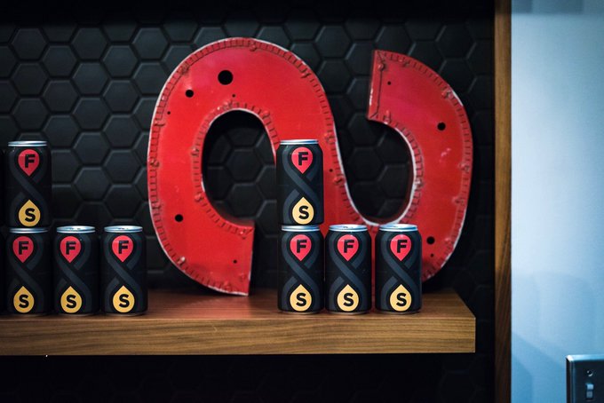
- “It’s since discontinued in cans, but Giantsbane was striking. The black-on-black was a unique look featuring matte black.”
- “I also appreciate our core beers with the Infinity Pint. They set the stage in the way we want.”
- “The old Vienna lager can. Not a crazy design but clean and fun.”
- “Clarity of Purpose and Circles of Confusion – those are wavy and interesting, forward-looking labels.”
Staying Ahead of the Curve
Like the craft beer industry, design leans on trends. Designs come and go—sometimes very frequently. To ensure their cans remain eye-catching, Sallee mentioned his team doesn’t have one set system, but that they lean on their genuine passion for beer and its branding aspect.
“We share cool designs to make sure we’re always thinking, Sallee says. “We keep a pulse on what other people are doing. There are so many talented brewers and designers in this country. Using them for inspiration is important to us.”
I’m excited for the next addition to Fair State’s brand portfolio. Sallee mentioned to me that something is in the works that he couldn’t share yet. Something tells me I’ll know it when I see it.
Feature Image Courtesy of Fair State Brewing Cooperative.



Submit a Comment