


Beer Label Art | Yellow Springs Brewery
 Story by:
David Nilsen
Story by:
David Nilsen
When it came time for Yellow Springs Brewery in western Ohio to redesign their logo and cans, they wanted designs that would express both the experimental freedom of the brewery and the intricate, complex precision with which master brewer Jeffrey McElfresh crafts their excellent range of beers.
Yellow Springs, Ohio, is a small town about twenty minutes from Dayton. Despite its diminutive size (pop: 3,680), Yellow Springs has been a hotbed of progressive political involvement since the 1960s and has a funky, counter-cultural atmosphere. Eclectic shops and eateries dot its main streets. A vibrant arts community weds talent to eccentricity and community to individualism. When Nate Cornett and Lisa Wolters founded the town’s eponymous brewery in 2012, they wanted it to represent those same combinations.
Their beer achieved those goals, with their Smokin’ Handsome smoked American brown ale winning a silver medal at the 2013 Great American Beer Festival and their flagship Captain Stardust Saison and Zoetic Pale Ale becoming household names for Dayton beer lovers. Unfortunately, their simple, understated cans began to underperform on area shelves against flashier packaging, and by 2016, it became obvious their brand needed a new paint job.
The Yellow Springs team wanted a new can design that would grab attention in a beer aisle, but a fortuitous friendship brought them much more than that. Sales manager Shawn Combs had previously worked for skateboarding brand Alien Workshop, and had worked alongside esteemed designer Don Pendleton, who had also done work for Element and won a Grammy for the cover design of Pearl Jam’s 2013 Lightning Bolt album. Combs and Pendletown had remained friends, and the sales manager convinced his brewery to reach out to the much-sought-after designer.
When the Yellow Springs team sat down with Pendleton in their taproom, they were just planning on redesigning their cans. Pendleton quickly recommended they give their logo a facelift as well. “We weren’t too keen on the idea at first,” says Wolters, “but as we worked through the can design process, we realized that he was indeed correct. Our old logo did not work nearly as well as the new one in the can scenario. We are super glad we made that decision and that Don recognized the need immediately.”
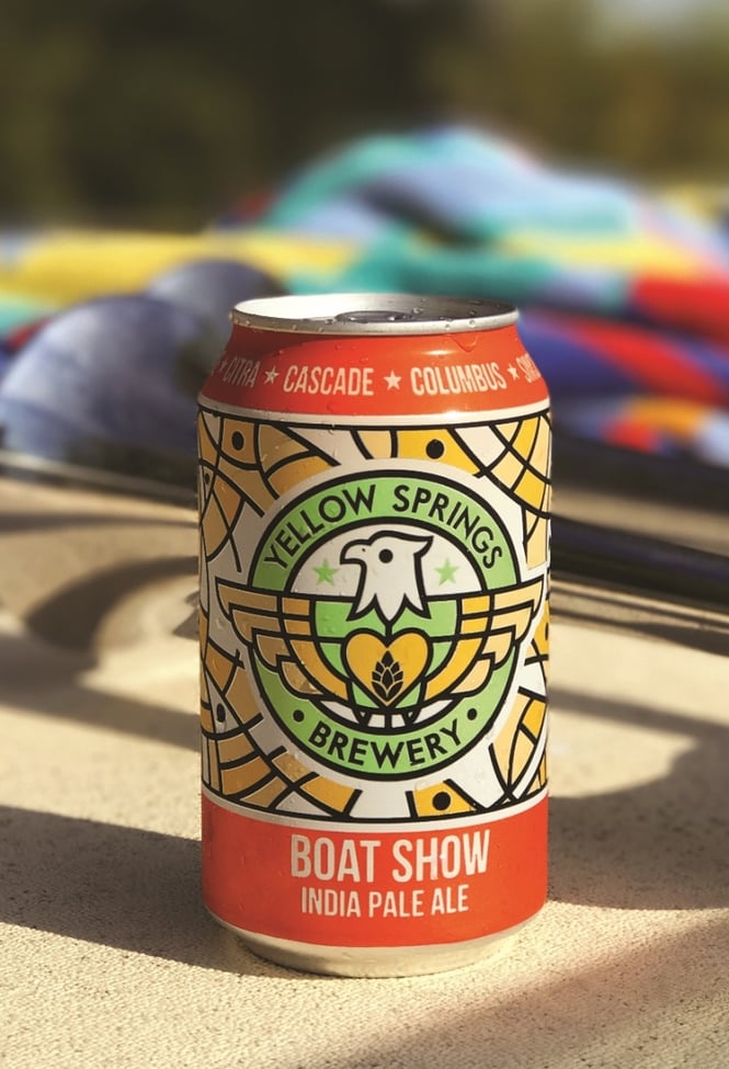
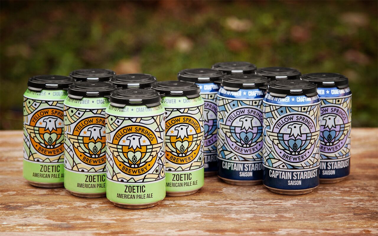
The new Yellow Springs logo features a multi-colored eagle—the colors change depending on the can for each beer—with a hop cone sitting inside its heart.
“The eagle, which is prominent in our new logo, was also present in a minor form on the old logo,” explains Wolters. “It has always represented the American entrepreneurial spirit in our minds and we still feel that it reflects the essence of our small independent business. It is a symbol that reminds us that big is not always better and some of the best ideas and products can come from a small group of creative folks.”
The hop in the eagle’s heart is a strong message about what the Yellow Springs Brewery team’s business and craft mean to them. “We feel that image indicates our thoughts and feelings about craft beer. We are a group of beer lovers who drink many different styles and love to try any good beer that comes our way. Beer is a way of life for most of us!”
Both the logo and the new can designs are consistent with Pendleton’s other work and feature nods to both cubist and abstract expressionist styles in what Wolters calls the artist’s “organic, linear style.” The complete package is both attention grabbing and clean, both chaotic and controlled. It’s an apt visual representation of what the brewery is trying to accomplish with the liquid they’re putting in those cans. They want customers to intuit from their packaging that the business is entrepreneurial and non-static but also precise and stable. It shows the eclectic nature of the brewery and the town it calls home, while also displaying the consistency and craftsmanship of its brewing team.
“I like the tension,” says Pendleton of his own work. “I like the potential for conflict.”
That deftly maintained visual tension has been a huge success for Yellow Springs since they launched the new design in November 2016. Customers can now recognize the brewery’s beers on a store shelf within seconds, and sales of their formerly underperforming cans have nearly doubled. They can barely keep up with demand. “The choice to change our logo changed everything for our brewery,” reflects Wolters.
Yellow Springs Brewery incorporates an artistic spirit into everything they do, not just their award-winning beers. Their airy, bright taproom is an informal art gallery displaying and selling a rotating series of art by local artists. That appreciation for a beautiful and meaningful image is now represented in their cans and logo as well.
A hop-hearted eagle is helping Yellow Springs Brewery soar.
[mc4wp_form]


Comments 0
No Readers' Pick yet.