
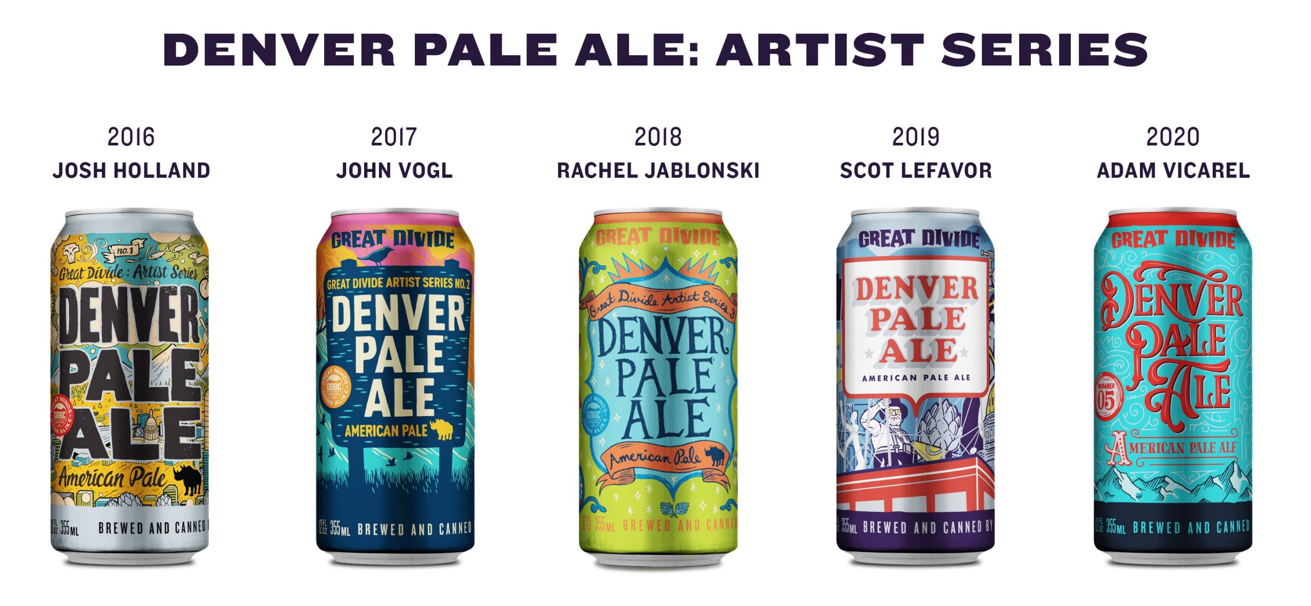
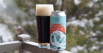
Great Divide’s Denver Pale Ale Artist Series #5 Featuring Adam Vicarel
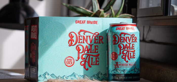
The next iteration of Great Divide‘s Denver Pale Ale will be hitting shelves shortly. Each year, the Denver brewery picks a local artist to create the artwork that will be displayed on the cans. This year’s can will feature the artwork of Denver-based artist, Adam Vicarel. It’s a wonderful opportunity for Great Divide to partner with a local artist who is widely known for his craft.
His work has been featured in the supermarket, on lifestyle apparel, and at your favorite recreational shop(s). He’s also created art for brands such as NBC, Sharpie, Alterra, Coleman and the SyFy Network. Not to mention, he’s made an appearance on “Real Housewives of Dallas.”
Adam’s artwork will be displayed in Great Divide’s taprooms in addition to bringing in related merch. Keep your eye out for that! You can follow him on Instagram @adamvicarel to enjoy his artwork.
[To Adam] What was the inspiration for your design?
In establishing the creative direction for this can design, I wanted to capture the juxtaposition of Denver’s founding years against modern-day Denver. Founded in 1858, Denver’s early years fell in the middle of the Victorian Era. This time period was characterized by elaborate and embellished typography, and ultimately those characteristics were the catalyst for the majority of the typography and lettering on this can.
How would you describe your artwork for the can?
To capture modern-day Denver I took a more casual approach to illustrating classic “Denver stuff,” such as mountains, the skyline, trees and camping gear. The monoline illustration style is intentionally quirky, and the density of these elements helps balance out the ornate and information-heavy designs on the front and sides of the can.
How did you land on the color scheme?
The bright color palette was intended to evoke the feelings of summer — bright and happy. This not only helps these cans stand out on shelf, but these colors look like an enticing, refreshing choice when in a cooler amidst some of its competitors.
[To Great Divide, answered by Matt Sandy, Marketing Manager] How did you end up working with Adam Vicarel?
We were immediately drawn to Adam’s incredible work with typography and the scope of some of his other projects when reviewing applicants for this year’s artist. We knew he would create something unique and eye-catching.
It’s impossible not to notice how much Denver has changed in the last decade, but when you stand back and take a 30,000 foot view, the transformation from pioneer town to modern metropolis is truly staggering. Adam captured that sentiment in a whimsical fashion that reflects the old and the new.
Each year, we’re floored by the creativity of our Artist Series artists and delighted with the final product. They’ve truly elevated our expectations of what is possible on a can.
Keep your eye out for the can as they hit distribution here soon!
Feature image: Great Divide Brewing

Related Posts
Loveland Aleworks | Blackberry Lemon Bar Sour... June 27, 2019 | Bryan Oldham
The Weekly Buzz | November 11 – 17 November 18, 2016 | Dan Bortz
4 Noses Brewing Co. | Großer Arber German-Style Dunkel... December 29, 2020 | Karen Mills
Weekly Growler Fill | National Beer News Roundup... July 27, 2015 | Chelsea Mitchell
Submit a Comment